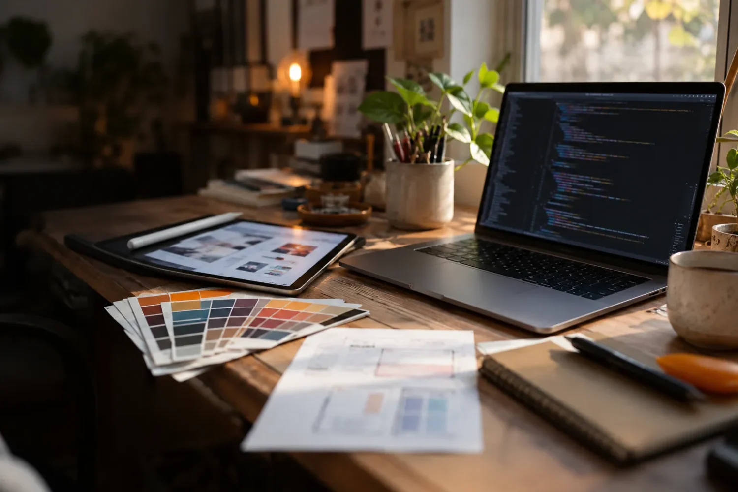
Pixel-accurate
Spacing, type and colours match your design on desktop, tablet and mobile.
Design to code
Designers draw it, we code it. Figma, XD or PSD in, a fast and responsive website out. No design yet? We can design it for you.
We build to the design, including spacing, type and states, then check it on real devices.
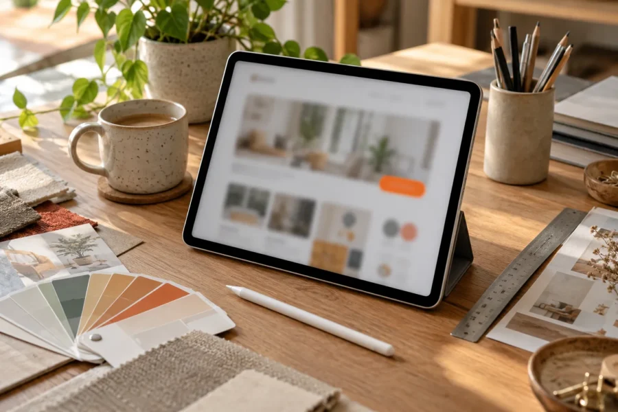
Spacing, type and colours match your design on desktop, tablet and mobile.
If the mobile layout is not designed, we propose one and check it with you.
Text, images and repeating items live in simple fields, so your client can change them.
Send the design files and we will quote after a quick review.
Your designers spend hours getting a layout exactly right. Then it gets built and comes back close but not quite. Spacing is off, the fonts are different, the mobile version was never discussed. We build to the design and check it against the file.
A Figma link, or the XD or PSD files, plus fonts and image assets. If only the desktop design exists, tell us. We will suggest a mobile layout that fits the same look and check it with you before building it out.
We match spacing, type, colour and states such as hovers and focus. Repeating content, such as team members or services, is set up as simple fields so your client can add more without touching the design. We test on real devices as we go.
Subtle animation that is described in the design is part of the build. Anything bigger, like custom interactive sections, is scoped separately so there are no surprises. See our project builds for how that works.
Design to code works well when you have in-house designers but no developers, or when a freelance developer keeps missing deadlines. Pair it with WordPress development for sites your client can edit.
Book a short call. We will talk through the project and tell you honestly if we are the right fit.